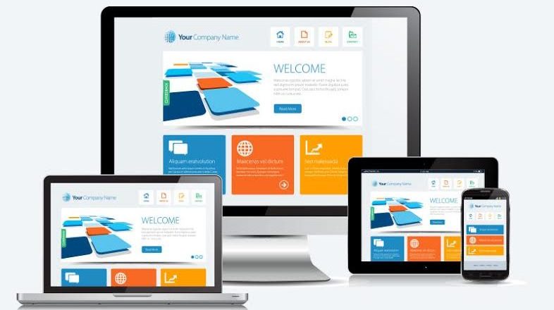
It used to be enough to be “mobile friendly.”
You’d create a desktop site (maybe even with goals and purpose in mind!) and then throw in a few media queries and call it a day. Users would see the same site whether they were looking at desktop, tablet, smart TV, or phone…but at least the text would be legible, no matter the device, right?
Those days are sooooo over. Mobile users – who make up 65% of online traffic – these days are less and less likely to ever see your desktop version, and yet for many agencies and designers, the desktop is still the starting point. Now, we’re not trying to change hearts and mind here, but we would love to see a little bit more thought put into the user experience of the majority!
Here are three ways mobile and desktop users vary in BEHAVIOUR, and how those can translate into design choices for mobile-heavy businesses.
Mobile users lack PATIENCE
Making mobile users click around or (heaven forfend) wait for a video or heavy site to load is more of a death knell than on desktop…possibly due to those of us who remember what it was like to have a website load in 20 seconds (and having to kick people off the home phone line in order to surf freely!)
Where you might have a bit of a grace period getting that ah-mazing video to load on desktop, if you make a mobile user wait even a few seconds, they’re gone – likely for good.
Mobile users BUY more (and are more likely to buy on sight)
This is a double-edged sword. If you are creating an e-commerce site on Shopify, for example, and relying on a theme to do the coding for you, judging a theme by it’s desktop look can lead to problems. Shopify sites are meant to be plug-and-play, but not all are created equal. If your store is suffering, it’s time to take a good hard look at the mobile experience you’re giving your users.
To do that, check your Google Analytics (which you TOTALLY had installed and check constantly, amiright) and then check for your mobile bounce rate – comparing it to your overall and to your desktop bounce rates. If mobile is high, that’s a big red flag. It’s not likely that a theme creator will drop everything to improve your shoppers’ user experience, but it can lead you to getting yourself a new, mobile-first theme.
Mobile users want fewer clicks
The fewest clicks possible is good business, no matter what device you’re talking about, but when it comes to mobile, your customers need a direct route since they won’t be as wowed by large images and flashy design. Convenience, clarity, and ease of use are more important than javascript and popups (oh lordie, how we hate popups) and mobile users expect all that and a pretty site.
Think about it…
People use computers while,
- Sitting at their desk
- In an office environment
- Randomly surfing the web
- Creating content or working on long and more-involved tasks involving special features
- Programming and performing configurations and technical tasks
People use mobiles while,
- Looking for instant information
- Performing a quick task like booking a ticket
- Sending out a quick email or message or a quick file share
- Chatting
- Walking around or being on-the-move
- Consuming content on social media or using an app
- Being at home, work, or other public places (possibly with slower internet and no wifi)
Create an experience that your mobile users will love, and the rewards will be yours. Seriously.